Flexbox
Is about laying out things on a single axis
- as a row
- as a column
Apply Flexbox
Apply flexbox to an element and it will change how its children behave. The item itself will still behave like a block level element. Below you see the CSS we apply
.flex-container {
	display: flex;
}
li {
	margin: 0 10px;
}
to this HTML.
<nav>
	<ul class="flex-container">
		<li>home</li>
		<li>about</li>
		<li>projects</li>
	</ul>
</nav>
The result can be seen below.
Flexbox Directions
The flex-direction controls on which axis the children will be laid out. By default we lay them out in a row. That means from left to right. This sets also the primary axis to go from the left to the right. But we can change this. If we want it to go from top to bottom we can set flex-direction: column. From right to left we can set flex-direction: row-reverse. From bottom to top we can set flex-direction: column-reverse. With each of these changes the primary axis also changes.
Flex Direction Row
Flex Direction Column
Flexbox Alignment
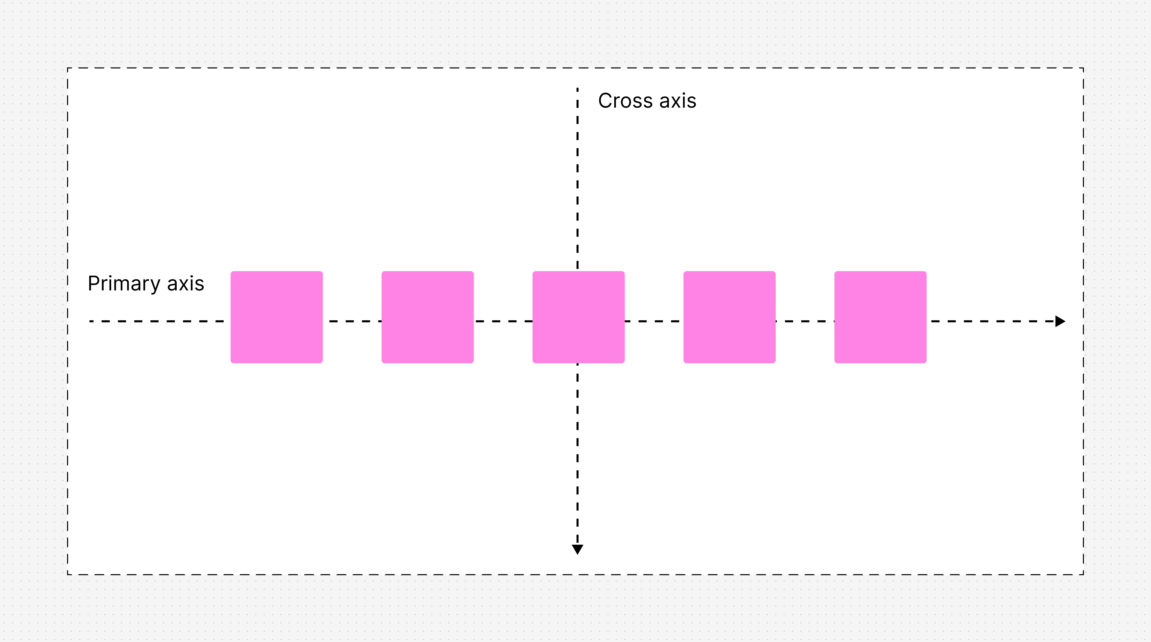
Primary Axis
For each of the axis we have properties to control the alignment. If we want to control the alignment on the primary axis we use the justify-content property. This property can take the following values (there are more but these are the most common ones, see MDN for more):
flex-start(default)flex-endcenterspace-betweenspace-aroundspace-evenly
Below you see how these values affect the alignment of the children.
justify-content: flex-start
1
2
3
4
5
justify-content: flex-end
1
2
3
4
5
justify-content: center
1
2
3
4
5
justify-content: space-between
1
2
3
4
5
justify-content: space-around
1
2
3
4
5
justify-content: space-evenly
1
2
3
4
5
Cross Axis
To control the alignment on the cross axis we use the align-items property. This property can take the following values (there are more but these are the most common ones, see MDN for more):
flex-startflex-endcenterstretch(default)baseline
align-items: stretch
1
2
3
4
5
align-items: flex-start
1
2
3
4
5
align-items: baseline
1
2
3
4
5
align-items: center
1
2
3
4
5
align-items: flex-end
1
2
3
4
5
Cross Axis Override
What if we want an item on the cross axis not to stretch or align itself to the end? Since we are not the first ones with this idea, flexbox has a property for that. The align-self. This overrides the align-items property for the individual item.
The values are the same as for align-items. See MDN for more information.
align-self: flex-end
1
2
3
4
5
We wont write out all combinations here since you can see the effect in the example for the cross-axis alignment.
Growing and Shrinking Items
flex-grow
The property flex-grow can be used to set which fraction of the
existing space an element can occupy (as long as there is enough space). From
MDN
For example, if four 100px flex items are in a 700px container and the flex items have flex-grow factors of 0, 1, 2, and 3, respectively, the total main size of the three items is 400px, meaning there is 300px of positive free space to be distributed. There are a total of 6 grow factors (3 + 2 + 1), therefore each grow factor is equal to 50px ((300px / 6 ). Each flex item is given an amount of positive free space equal to this amount multiplied by its flex-grow value — so 0, 50px, 100px, and 150px respectively. The total flex item sizes are therefore 100px, 150px, 200px, and 250px respectively.
Example Flex Grow
In the example below we set the flex-basis for each item to
100px and the flex-grow factor to 3,2,1 and 0.
factor 3
factor 2
factor 1
factor 0
flex-shrink
The property flex-shrink defines in which proportion an element
should shrink relative to all other flex items in the container.
Example Flex Shrink
In the example below we set the flex-basis for each item to
300px and the flex-shrink factor to 4,3,2 and 1.
factor 4
factor 3
factor 2
factor 1
The flex Shorthand
TBD.
Wrapping Items
If we don’t have enough space available flexbox allows us to define a the property flex-wrap to tell the items to wrap.
Flex Wrap Example
In the example below we apply flex-wrap: wrap; to the container. Since all the items have a flex-basis of 256px they wrap around.
Space between items (gap)
To control the space between items we can use margin, but flexbox comes with its own property gap. This property can take any CSS length value.
Gap Example
In the example below we apply gap: 16px; and justify-content: center; to the container.
Item 1
Item 2
Item 3